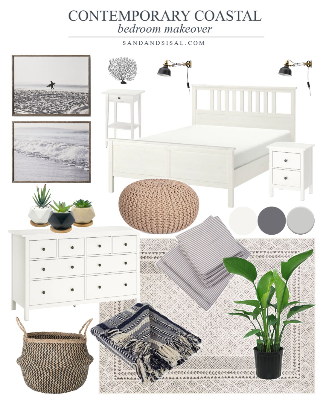
What a whirlwind the last few months have been! We married off my daughter, celebrated the holidays and multiple birthdays with family and friends and started several DIY projects. My daughter moved out to start her new life and my oldest son was very anxious to take over her bedroom and finally have a room of his own. He’s had to share a room most of his life with his little brother who is 5 years younger. Even though he is about to leave for college this coming fall, I wanted to give him a nice space of his own that would appeal to both a young adult and work as a guest room. After much compromise on the direction the room would go, we focused on a modern coastal design approach. I’m happy to share the Contemporary Coastal Bedroom Design Board for the room!
What is Contemporary and Modern Coastal Design?
Contemporary coastal design and modern coastal design are pretty much synonymous with a minimalist approach to decorating that incorporates clean lines, natural wood tones, fibers, and decor, a multitude of textures, and a subdued color palette that welcomes strong accents, and plenty of fresh greenery. The beauty of contemporary and modern coastal design is that it isn’t cold or rigid. Modern coastal design is warm, relaxed and welcoming. Serena & Lily , Salt Design Company and Pure Salt Interiors all exude this style and are amazing inspiration for me. 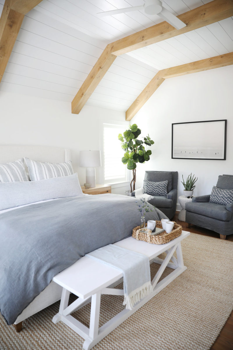
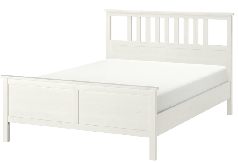
Choosing a bed or headboard for this room was the first piece of furniture that I wanted to tackle. My initial choices were very clean and modern and in natural wood tones but the price points for the beds were out of our budget. Remember, we have just paid for a wedding and have our 2nd daughter in college and now our son is heading off to college so this room had to be affordable (four children will drain your financial resources people!).
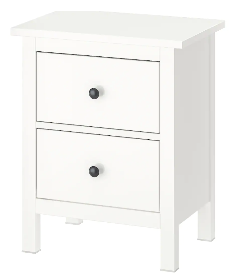
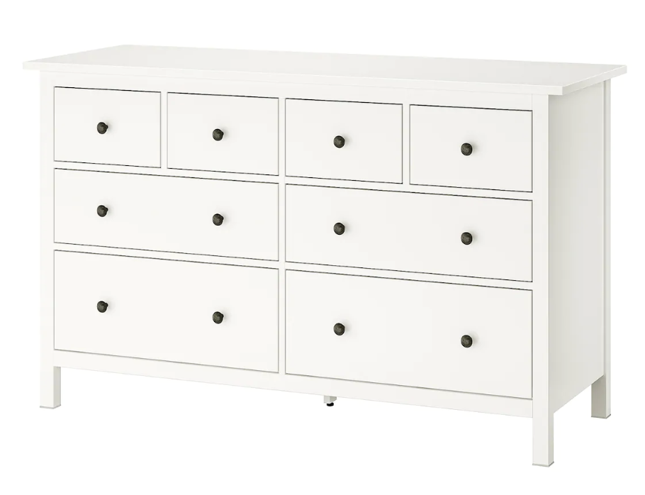
When it came down to choosing the best design option with affordability I went with IKEA. Thankfully, an IKEA recently opened up here in our area and this collection was made of solid wood and not MDF. I chose the Hemnes collection for the bedroom furniture suite and actually have plans to tweak it up a bit in the future (that tutorial will come later).This collection comes in a multitude of colors and stains. We chose the white stain which is quite sheer and allows the wood to show through. I wanted it to look more natural than painted so that is why we chose the white stain over white paint.
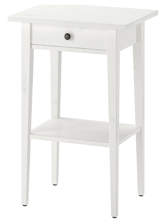
I chose to not be super matchy-matchy with the night stands but stay in the same collection.
The dresser was want my son wanted most. Wow, this one is fabulous! It was much larger than I expected but has an amazing amount of storage. I would love to put seagrass wallpaper on the drawer fronts soon but I might need to wait until my son leaves for college! I will admit that we all were in a bit of IKEA building hell for several days. It was our first experience building IKEA furniture. Let’s just say you need to be a very visual person and I do NOT recommend building any piece of furniture with your husband or son if you all have different visual or building views. (A-hem…. we will leave that there…. we survived and I’m still married so that’s good).
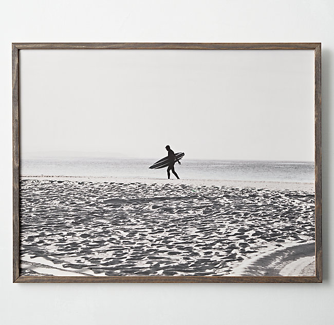
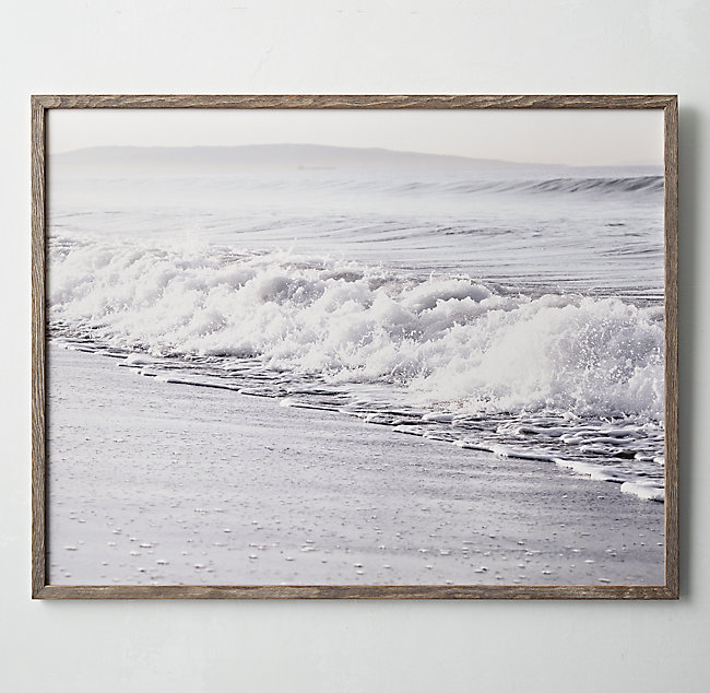
My boys and husband are all avid surfers. We wanted to incorporate some surf art into this room but keep it in the neutral color palette of black and white and brown. My hopes are to feature black and white photography of my son surfing. In the mean time these are some surf artwork which inspired us.
GET THE LOOK!
All these other items are what we are considering for the room. All the photos below are clickable and shoppable affiliate links for your shopping convenience. Simply click on the photos to be taken to the store to shop.
Items not included in slide show above:
I can’t wait to show off the room when it’s finally finished! Be sure to follow me on Instagram to see updated stories on this room. I am over there more than any other social media platform so I hope you are following along over on IG. The contemporary bedroom reveal will be coming up soon. Stay tuned!
PIN IT IF YOU LOVE IT!

Happy Decorating!
KIM

I am trying to find the links to the products listed in this room and am having no luck. Any advice? Thanks so much
Hi Tammy!
I have the product links throughout the blog post. They are the text in blue. I did go back and made them bold to be seen better. There is also a product photo slide show near the bottom of the post (right under “Get The Look”). You can click on any of the little slideshow pics to be taken directly to the store. Hope that helps! The room reveal will hopefully be next week. We lost internet on Tuesday and finally got it back today so this week has been stressful. Thanks for stopping by, I appreciate it!
Best,
KIM
I found them, thanks so much! What paint colors did you use?
Thanks! The wall color we used is Agreeable Gray by Sherwin Williams.