I’m going green this year. Yes, I said green. Did you know that green is opposite red on the color wheel? So I’m doing the opposite of what is traditionally done on Valentine’s Day. Who says Valentine’s decorations have to be red anyhow? I grow weary of the same old pink and red color scheme each year. This time I needed a change and wanted to take a more subtle, yet fresh approach to Valentine’s décor. What’s more fresh than spring green?!
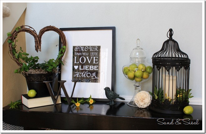
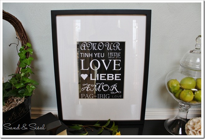
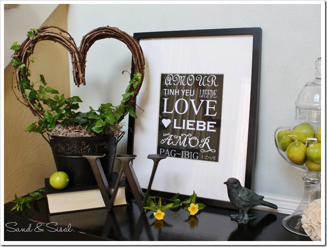
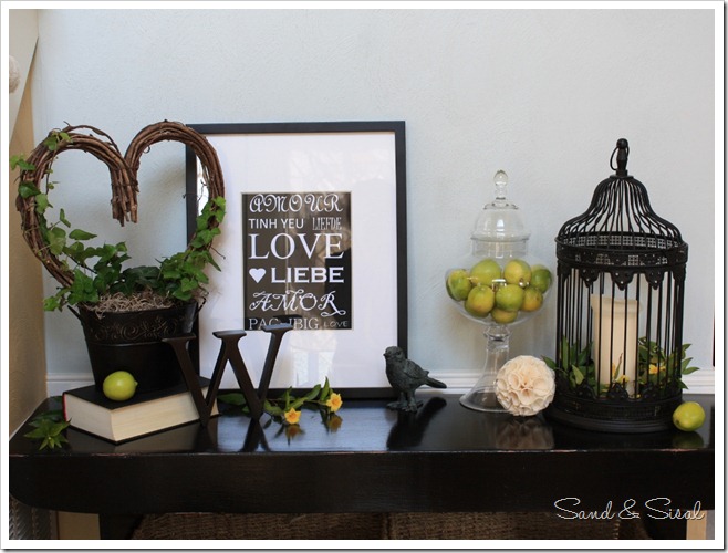
When decorating I strongly believe in using what you already have or creating something new, versus running out to the store just to find something that’ll work. I’m loving this Love Languages Subway Art. I searched the internet for the word “love” in different languages, arranged the words in MS Word, printed them out, and inserted the sheet into a frame already had on hand. You can see another multi-language art piece I painted by clicking “Thanksgiving Subway Art”.
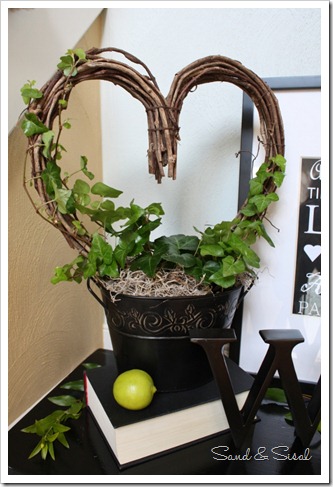
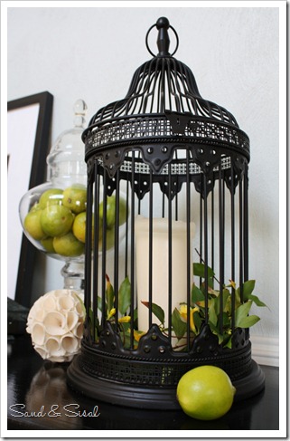
Now for the green! Fresh greenery brightens my mood in the dreary winter, so I tend to have many plants in each room. I like the bright pop of color it adds. A fresh ivy topiary is planted in a black tin and an iron bird holds a pillar candle. A few springs of blooming Carolina Jessamine encircle the candle. It’s been such a warm winter, everything is blooming! I love it! I then filled an apothecary glass container with limes. Lemon and limes are always a staple in our home so there’s no worry about them going to waste.
For a humorous touch, this little iron love bird sits outside his cage. My kids were not happy that he wasn’t in his correct place! Ahhh, rules-shmoolz… let the birdy free I say!!
And of course our family initial “W” from Restoration Hardware is placed near the Love Language Art. It’s a reminder to us to love one another in our family at all times. Decorative items should always hold some type of meaning or memory for you. That’s what makes it special, otherwise they are just “things”.
A fresh green Valentine’s display still celebrates the season but in an unconventional way!
You can check out my Simple Valentine Tablescape which is currently featured on Better Homes & Garden’s website, entitled Valentine–Themed Dessert Display!!! So exciting!
Kim
Linking up to:
 |
 |
 |
 |
 |
 |

This is such an original and fantastic mantel, Kim! I love everything, especially your subway art and the heart shaped topiary (is that what it is called??!).
Congratulations on your feature on the BH&G website. I am going to pop over there to see it! 🙂
XO,
Jane
Thank you Jane! There’s a lot of bloggers featured too. I’m just excited to be among them!
Looks great, love it!
Thank you!
You guys are cute with the “lemons” and “limes” hehe. Love that little bird…I’m loving birds this year :)Nice job!
Haha! You must be referring to Beth’s mantel? I swear it wasn’t planned. Chalk it up to sisterly esp! 🙂 Thank You!!!
That really looks great! It’s so nice to see a new spin on the traditional red & pink palette of Valentine’s Day.
Thanks Gina! I was in the mood for a change this year. 🙂
I love, love, love your valentines decor!!! Great job!
How sweet of you! Thanks!
I think this vignette is my favorite thing I’ve seen today! I love everything about it. I also checked out your Thanksgiving subway art, which I LOVED! you have a great creative flair! I’m your newest follower!
What a wonderful comment! You made my day! Thank you so much, I really appreciate it!
Kim this is beautiful. I loved it so much that I featured it today over at Scribbles and Swirls. Please take a look http://tamiscribblesandswirls.blogspot.com/2012/02/fresh-green-valentines-display.html and hope you will also follow along.
Thanks for the inspiration.
~Tami @ Scribbles and Swirls
i love your love languages framed art!